OBJECTIVE
Redesign a logo for a construction company called Thedford Independent Consulting.
PROCESS
Thedford Independent Consulting (TIC), a construction company, reached out to me for a logo redesign. The client expressed dissatisfaction with their current logo, citing its disconnect from the brand identity. Despite lacking specific preferences, they granted me creative freedom to redefine their visual representation.
Through a process of exploration, refinement, and several iterations, I successfully crafted a logo that resonated seamlessly with the company’s essence. The chosen design features a sophisticated 3D hexagon shape, cleverly resembling a screw, offering a perfect blend of form and function that aligns flawlessly with TIC’s professional image.
MEDIUM/TOOLS USED
Adobe Illustrator
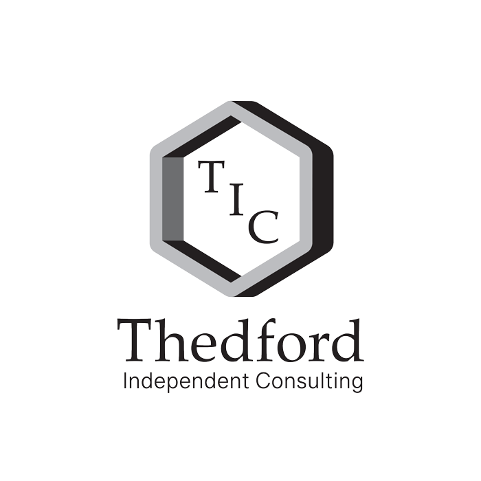
Black & White TIC logo (vertical)
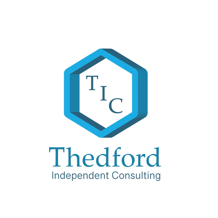
Full Colour TIC logo (vertical)